Case Study

From a tired website to a modern, mobile-first shop front

Young's Collision Center has been a family-owned auto body shop in Lancaster, Ohio, since 1985. Here's a look at the full rebuild of their web presence, from the ground up.

4.41sOld homepage load
→
310msNew homepage load
~93% faster
Homepage load time
0 → 1
About page (didn't exist before)
0 → complete
Search engine info
Mobile-first
Built for the phone, not shrunk to fit
Why It Matters

The gap between "fast enough" and what Google actually rewards

Google doesn't just prefer fast pages. It grades them. A homepage only earns a "good" rating if its main content loads in 2.5 seconds or less; anything close to the old site's 4.41 seconds already misses that bar. Google's own research also found that as mobile load time climbs from one second to three, the odds a visitor bounces before the page even finishes loading jump by 32%, and by five seconds, that jump is 90%. At 310 milliseconds, the new homepage isn't just faster than before. It's comfortably inside the range Google rewards, and the range visitors actually stick around for.

Mobile navigation & CTAs

Built for the phone first, not as an afterthought

Most people searching for a collision shop are doing it from their phone, often right after an accident. The old mobile site buried navigation behind a hamburger menu with no quick way to call, and even had a typo in the headline. The new one puts a tap-to-call icon front and center, with two clearly different calls to action.

Before
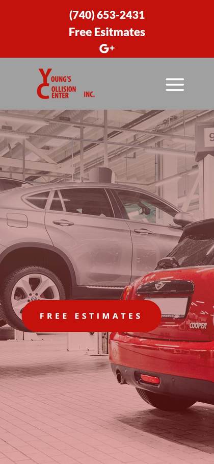
Old mobile homepage
Hamburger-only nav, no quick call, and a headline typo ("Esitmates").
After
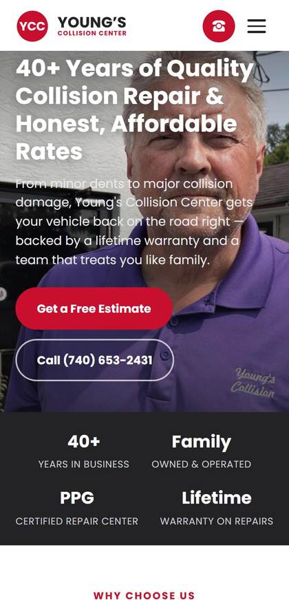
New mobile homepage
Tap-to-call icon in the header, two clear stacked CTAs.

Branding

A brand that actually looks like a 40-year business

The old logo was plain stacked text with no mark, and the red shade shifted slightly depending on where it showed up on the page. The new brand has an actual mark, one consistent color used everywhere, and a favicon that doesn't look like a default placeholder.

Before
Old site header and logo
After
New site header and logo
About page

Giving people a reason to trust Jeff before they ever call

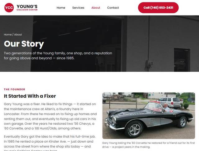
The old site never told the story at all. There was no About page, just a phone number. The new site has an actual "Our Story" page, with two generations of the Young family, real photos, and a timeline from 1985 to today.

Before
—

No About page existed on the old site.

After
New About page hero
The founder narrative, with a real photo of Gary's restored '60 Corvette.
Modernized experience

A homepage that makes the case for calling

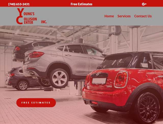
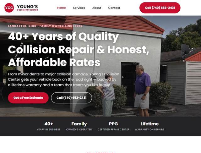
The old homepage opened with a wide shot of cars on lifts, accurate but generic, with nobody in sight. The new one leads with Jeff himself, standing at the shop, with trust signals (40+ years, family owned, PPG certified, lifetime warranty) right under the fold.

Before
Old homepage
After
New homepage
Modernized experience, continued

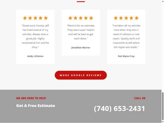
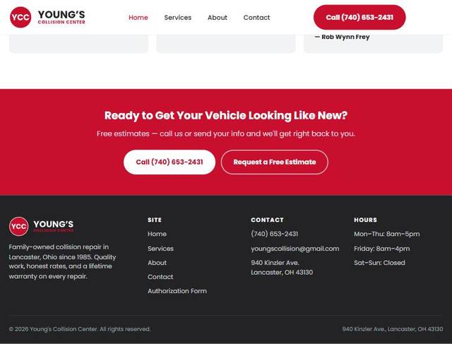
A footer that actually tells you how to find them

The old footer was a phone number on a gray bar. The new one has the full address, hours, email, and a simple site map. It's everything someone needs to decide whether to drive over right now.

Before
Old site footer
After
New site footer
Behind the scenes

What Google couldn't see before

Search engines couldn't read the old page at all because it lacked a description, a proper title, and the hidden data Google relies on. Now, all of those behind-the-scenes details are finally locked in. While these updates won't change how the site looks to a visitor, they completely change whether people can actually find it in the first place.

The result

A site that loads fast, looks current, and makes it easy to say yes

4.41s
→
310ms

This is the same process behind every site built at Marsh n Main, finding what's quietly costing a business trust and customers, and fixing it, without a redesign that takes months or a price tag that doesn't make sense for a small shop.

Let's talk about your site →